Introduction
My wife and I use Natural Family Planning (NFP). In fact, full disclosure, my wife teaches NFP. For those that may not know, NFP is a way to achieve or avoid pregnancy naturally by using a woman's natural signs and observations throughout her cycle to determine the couple's fertility on any given day. No, it's not the rhythm method. It is actually quite effective in avoiding and achieving pregnancy, it encourages mutual support and communication about sex between the couple, and it does not require the use of hormones or devices to be effective. Sounds pretty good, huh? For more information, click here.The specific brand of NFP we use is called the Creighton Model FertilityCare System. As part of using this system, the couple charts the signs/observations for every day of the cycle on a paper chart. When the cycle is complete, a new row on the chart is used. This is repeated over and over for every cycle. You get the following when you have completely filled out a chart:

At some point, I realized that my wife's many charts of her cycles formed a great dataset. I know for every day of her cycle for the past 3 years what her fertility is and what the specific signs and observations associated with that day are. I thought to myself, couldn't I visualize this data in a useful way to look at, say, a given day's likelihood of being fertile? What other sorts of information could I gather from the charts?
Below are my observations and visualizations of what I uncovered about our use of NFP. Yes, I am doing this with my wife's full knowledge, consent, editing, approval, and blessing. Thanks for asking. Yes, this is extremely personal, but I think it is worthwhile for our own and other's understanding of NFP and its uses.
If you are squeamish about topics related to sex, menstrual cycles, bodily fluids, and so forth, you probably should just stop here. I'll try to be as clinical and impersonal as possible so that we can focus on the data and it's implications.
Understanding the Data
For every day, a user of the NFP system records several aspects of her fertility observations, which are recorded in the following way (for understanding more fully what this means, click here):- Color stamp:
- Red (menstrual flow, spotting), Green (dry), Yellow (non-fertile discharge), White-baby (mucus), Green-baby (dry day within peak plus 3)
- Number:
- 0,2,4: various forms of dry observations
- 6,8,10 - indicates the length of the mucus
- Letters:
- VL (very light), L (light), M (medium), H (Heavy. Used on red days.
- C (cloudy), K (clear), L (lubricative), P (pasty), B (brown), Y (Yellow), G (Gummy). Used on mucus or discharge days.
- xX or AD:
- indicates number of observations. E.g., x3 indicates 3 times observed that day. AD means all day.
- I: whether intercourse took place that day.
So, if you saw this:
That would mean, "on 5/4 there was fertile peak type mucus that was peak type that was stretchy, cloudy, clear, and lubricative, and it was observed all day."
I converted this information into rows with the following columns:
- Date
- Day of cycle
- Stamp
- Number
- Flow type (VL, L, M, H)
- Type (0,4,6,8,10)
- Letters (B, C, K, L, G, Y, P)
- Duration
- Intercourse
- PeakDay
- Avoiding?
- Pregnant?
- Nursing?
- PostPartum?
- PMS?
- Headache?
- Fertile?
There were 1,114 row (days) in the dataset, consisting of 36 cycles.
What can we learn from this dataset?
Analysis and Visualization
Time for the fun. I'll be using this opportunity to explore Microsoft's latest Power BI offerings for visualization.
A typical cycle lasts about 26 days (26.33 days with standard deviation of 1.66). The longest cycle is 29 days (excluding the cycle in which a conception occurred), or 31 (if we count up to the day of confirmed pregnancy).

Stamps
What does a typical cycle look like in this dataset? Look at the graph below. The day of the cycle is along the x-axis and the percentage of stamp type is along the y-axis.

Note: I couldn't rearrange the stacking order of the categories in PowerBI, so I used Excel for this chart.
The first five days are always menstrual flow. Then this tapers off on days 6, 7, and 8 and gives way to either dry days (green) or fertile days (white). The fertile days peak in days 11, 12, and 13 and then give way to discharge days (yellow) or dry days. There are occasional spotting (red) days throughout and occasional fertile days near the end of the cycle.
The rising and falling of each kind of stamp is more easily seen in the below chart.

Menstrual Flow
The first five days are always menstrual flow. Then it declines to day 10. The kind of flow changes over the course of this time period. Usually, the first day is medium or heavy. The second day is almost always heavy. The third is usually medium. Then we progress to medium or light, then light or brown, then very light or brown for the rest menstrual flow. See the below chart.

So a typical progression could be medium, heavy, medium, light, very light, brown.
Type
Consider the ugly and poorly designed chart below of type of mucus. This reflects how long the mucus can stretch.

Note: an example of what not to do in data visualization.
There is a lot going on and it is not easy to see (partly deliberate). I'll bring out the important points and show the individual graph as well.
- 0: dry days are rare except in two peaks. The first is days 7-12, which is between the menstrual flow and the mucus buildup. The second is after ovulation has occurred (the mucus), resulting in dry days for the rest of the cycle.

- 2: relatively dry days are similar to 0 in exhibiting two peaks along the same lines, but with more counts.

- 4: starts off at day 4 relatively high, then dips down a little during the mucus buildup. There is a little peak after the mucus build up. None of the peaks are very strong.

- 6: for cloudy/pasty discharge there are two peaks. The first is in days 5-8 (just after the menstrual flow but before any mucus). The second occurs in days 15-18 (immediately after the mucus) and then steadily declines (giving way to dryer days).

- 8: this mucus observation becomes more and more common, from nearly nothing, to peaking around days 14 and 15 (immediately after the peak in the cycle) and then suddenly dropping to very few for the rest of the cycle.

- 10: this kind of mucus builds from nothing to peaking in days 10-13 and then declines again towards the end of the cycle.

The change from 2 peaks (0,2,4) to 1 peak (6,8,10) can be seen in the follow graph:

The color changes from light (0) to dark (10) as the type of mucus increases in value. This is easier to see when I group 0,2,4 as light and 6,8,10 as dark:

Peak By Day
When does the cycle reach its peak? On average, about15 days (14.62 with 2.09 standard deviation). Along with the average length of a cycle, this results in a post-peak phase of about 11 days (11.57 with 2.08 standard deviation). Below is a stacked area graph representing the counts of occurrences of the peak day (P) and days following the peak day (1-15) by the day of the cycle.

Note: I couldn't figure out how to reorder the legend to be P-15. It treats it as categorical instead of numerical/linear. Ideally, the P would be on the bottom of the stack, then 1, then 2, etc. through 15.
Since the above graph is a little difficult to understand (although perhaps intriguing), below shows only the peak day distribution:

Note: perhaps this area chart isn't the best option for displaying counts over time.
PMS
PMS only seems to occur following the Peak day. It increases in likelihood as one nears the beginning of the next cycle. This should not be surprising as PMS is "pre-menstrual" and for many women seems to signal the coming of the next cycle.

Note: This chart is from Excel. Power BI can't rearrange the X-axis appropriately.
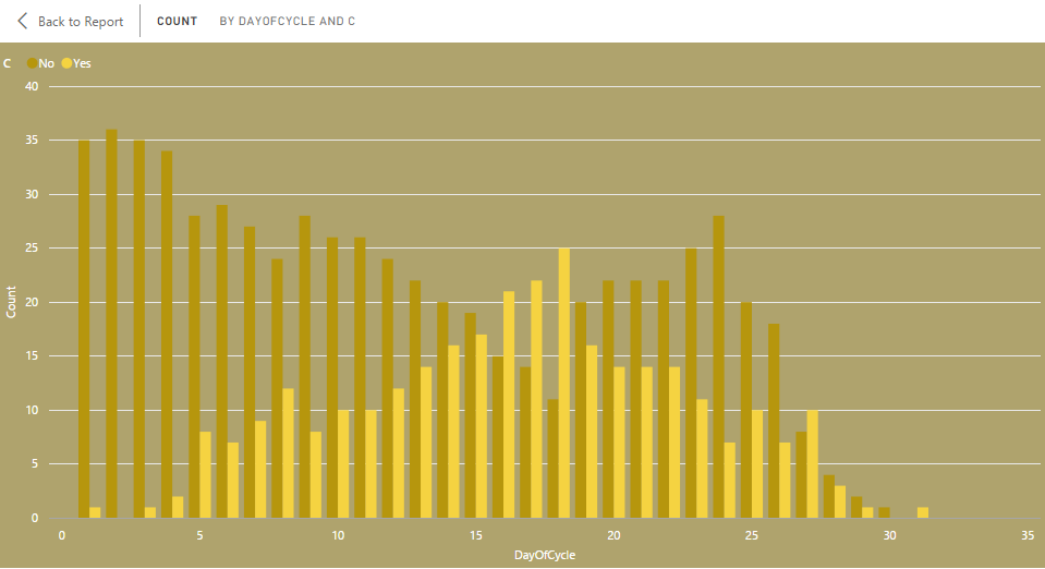
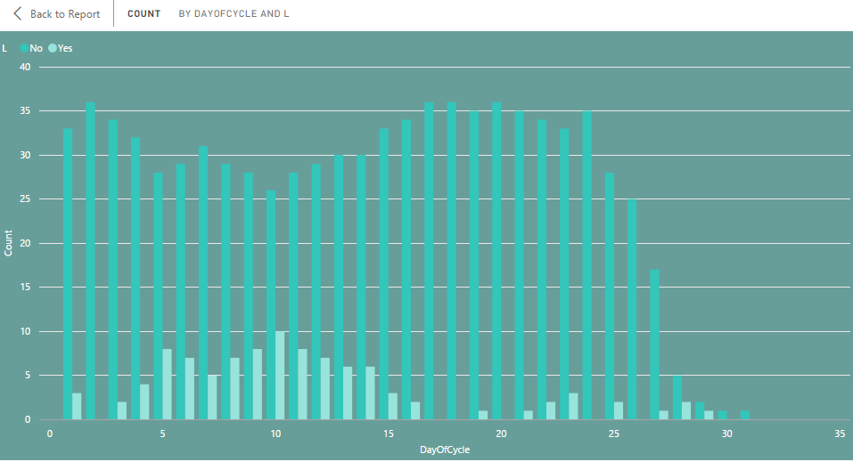
Intercourse
When does intercourse occur? Consider the below chart:

We see a general pattern that is similar to a pattern we have seen before. A first peak at around day 7, then dropping down in the middle about day 14, and then another peak about day 23, and then falling again. What is going on here?
The peaks in intercourse correspond to infertile days, while the drop in the middle corresponds to the fertile days of a typical cycle. And this should be no surprise for users of the system. A couple will, when avoiding pregnancy (which may be most of the time), use infertile days for intercourse while avoiding fertile days. This is easier to see in the following two charts which filter on the couple's use of the method: (1) avoiding a pregnancy and (2) not avoiding a pregnancy.
The first chart below shows the couple avoiding a pregnancy, and hence, only using the infertile days for intercourse. This is why we see two peaks, corresponding to the infertile days in the cycle.

In this second chart, the couple is not avoiding a pregnancy, and hence, intercourse occurs throughout the cycle.

For a fuller picture, consider the following table:
Avoiding
Pregnancy?
|
Fertile?
|
Intercourse
|
No Intercourse
|
Sum Of Row
|
Intercourse/Sum Of Row
|
No
|
Yes
|
28
|
50
|
78
|
0.36
|
No
|
No
|
51
|
127
|
178
|
0.29
|
Yes
|
Yes
|
7
|
394
|
401
|
0.02
|
Yes
|
No
|
171
|
285
|
456
|
0.38
|
Sum Of Column
|
257
|
856
|
1113
|
0.23
|
The couple has intercourse 23% of the time. But this 23% is not equally distributed amongst fertile vs. infertile days and avoiding vs. non-avoiding days. Starting with avoiding days, when the couple is fertile, about 2% of days are used for intercourse. Note that this 2% would be an improper use of the system. When infertile, 38% of the days are used for intercourse. When not avoiding, the fertile days are used 36% of the time for intercourse; the infertile days are used 29% of the time.
Given the foregoing, we can calculate that 35% of the time, the couple has intercourse when the fertility is in line with the avoiding vs. not avoiding intention (that is, when excluding the days in which the couple is fertile but is trying to avoid a pregnancy).
Various sources online citing how often a couple has sex on "average" per year give numbers like 104, 112, 118, 124, 127. So 29% to 35% of all days in a year. Thus, the above is in the "normal" range.
Letters
I broke the Letters column into a column of "Yes" or "No" values for each letter - B, C, K, L, G, Y, and P. For example, if "CKL" was recorded, then C, K, and L columns would have a "Yes" for that row, while the other letter columns would have a "No". Let's look at each of these:
B
Brown spotting occurs usually during or right after the menstrual flow. However, it also is known to occur at ovulation. This is likely what happened on day 14.

C
Cloudy mucus/discharge increases to a peak about day 17 and then declines afterwards. This peak is right after the Peak day. The C is associated with the yellow stamp, so it is not surprising that we see it following in much the same pattern.
K
K (clear) type mucus is associated with the buildup to and the occurrence of the peak of the cycle (e.g., ovulation). So it is not surprising that Ks peak around days 11-13, right before and at a typical Peak day. They fall back down again to almost nothing afterwards.

L
Lubricative days are also associated with fertility, and hence, appear most often in the buildup to and around the Peak day of the cycle. These then decline afterwards with a few signs following after the peak.
G
Gummy type discharge doesn't really show any pattern. While rare, it is distributed fairly evenly across the middle of the cycle, avoiding the very beginning and very ends of the cycle.

P
Pasty discharge shows two peaks and is typically associated with the yellow stamps. The first peak occurs right after the menstrual flow and then declines to almost nothing before the Peak. Then it builds back up to day 18 as the mucus gives way. It then declines again towards the end of the cycle.
Y
Yellow discharge doesn't show much of a pattern, except perhaps two groupings: right after the menstrual flow and right after the Peak day and following. But this is also a pretty rare occurrence.
Fertility
Finally, we can look at the fertile vs. non-fertile days. Since red days and white days are treated as fertile, along with Peak 0,1,2 and 3 days, the fertile days follow the pattern of the red and white days put together along with the days just after the peak.

Summary
In short, we can see that this woman's typical cycle lasts about 26 days, with ovulation (peak day as an estimate) occurring around day 15. The menstrual flow lasts for 5 days before giving way to the mucus build up towards ovulation. After the peak, discharge gives way to dry days as the cycle winds down to its end. Then the cycle repeats. Fertile signs occur in a single peak in the middle of the cycle, while infertile signs form two peaks on either side of the fertile peak.
Because the couple is using the system most of the time to avoid pregnancy, intercourse follows the pattern of infertile days: a smaller peak before ovulation and a larger peak after ovulation. When the couple is not avoiding a pregnancy, intercourse occurs throughout the cycle.
Conclusion: Why It Matters
So what? Why is this important? Here are some data-driven/analytics reasons that one can see from the above data and charts above:
- Predictability: a couple/woman that charts the cycle can get a sense of what is normal. They/she can predict when the woman will be fertile or infertile based on past cycles.
- Planning: Predictability is especially useful when trying to achieve or avoid a pregnancy. One can determine when to have intercourse so as to increase the chances of a pregnancy occurring (useful for couples struggling with infertility) or to avoid a pregnancy. The woman can also determine when her next cycle is likely to begin, and can prepare for her menstrual flow. Finally, other aspects associated with the cycle (e.g., PMS, headaches, cramping) can be recognized as cyclical/hormonal and prepared for/addressed appropriately.
- Disease prevention and health awareness: a woman that knows what her typical cycle looks like can recognize an abnormal cycle, which can indicate various kinds of diseases or complications. The woman's cycle is a great indicator of health and can point to hormonal imbalances, Polycystic Ovarian Syndrome (PCOS), abnormal bleeding, infertility, and many other health issues.
- Infertility treatment: a couple trying to achieve a pregnancy can pinpoint the most fertile days. Furthermore, a trained health professional can use the information contained in the chart to assess the couple for various kinds of infertility issues (e.g., limited mucus) and recommend treatments to increase fertility.
In addition to the above considerations, here are some other more philosophical considerations that are not based on the above data:
- Hormone free, all natural, green, organic sex: the couple requires no birth control devices, barriers, hormones, pills, or chemicals for an effective method of achieving and avoiding a pregnancy.
- Ethical: some couples may be concerned about the ethics of the potential abortifacient mechanisms of birth control methods or in using assisted reproductive technologies, such as in vitro fertilization. These natural methods avoid those ethical concerns for both avoiding and achieving a pregnancy.
- Communication: the system encourages and to a certain extent requires the couple to communicate about their sexual health and intentions with regards to achieving or avoiding a pregnancy. It is a shared system in which all information is available to both the man and the woman. Each month, the couple revisits questions related to achieving or avoiding a pregnancy to help the couple remain on the same page in regards to their sex and family life.
In short, there are both good philosophical and analytical reasons for using NFP. If you are interested in finding out more about this, click here.
In any case, the data generated by users of the system provides a fruitful and interesting area for exploration and discovery, not only about oneself, but also about health, fertility, and sex in general.
In any case, the data generated by users of the system provides a fruitful and interesting area for exploration and discovery, not only about oneself, but also about health, fertility, and sex in general.
Hi, thanks so much for sharing. My biggest challenge with Creighton is the paper charts. How I wish there was an app on which I could log info and then print for my doc. I do not info on the Ovuview chart, but I still need to transfer to a paper chart, so currently I have about 6 months pending to transfer. Ugh
ReplyDeleteCould you by any means share your Excel spreadsheet...I don't need the data, just something that looks like the paper sheet and which I can fill and print out? Thanks a lot in advance.